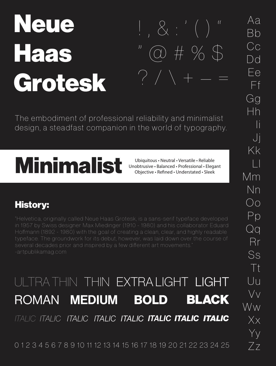
The project:
In my attendance at Arizona State I took a class with a focus in print design. For this project we were tasked with creating an FCC (Font / Character / Composition) typeface poster. With this we were given the opportunity to choose the font from a pre-approved list. I chose Neue Haas Grotesk.
"Helvetica, originally called Neue Haas Grotesk, is a sans-serif typeface developed in 1957 by Swiss designer Max Miedinger (1910 - 1980) and his collaborator Eduard Hoffmann (1892 - 1980) with the goal of creating a clean, clear, and highly readable typeface. The groundwork for its debut, however, was laid down over the course of several decades prior and inspired by a few different art movements." -artpublikamag.com
The design:
Neue Haas Grotesk is a sleek, modern, minimalist font. When creating my typeface poster I wanted to capture that. I went for a black background and white typeface; utilizing margins and padding to create the look I wanted. I featured the different characters, weights, and styles of the font in a grid-like structure.